Tuesday, 28 January 2014

Designing Sets

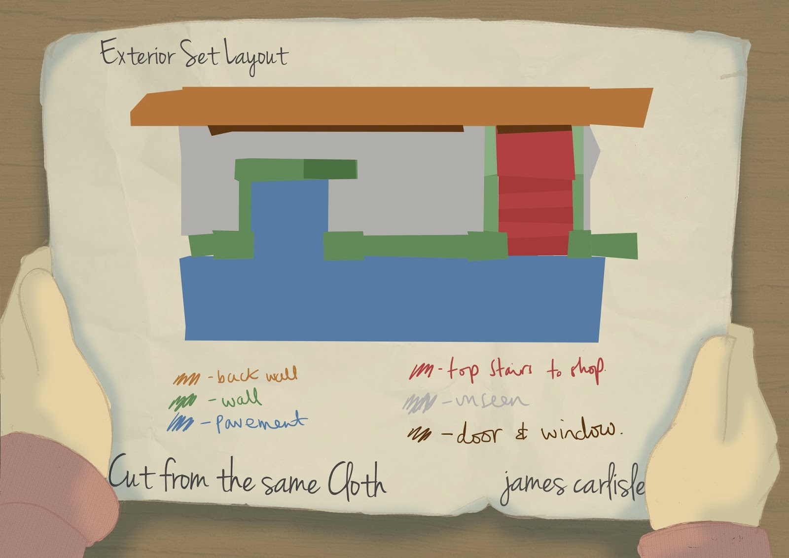
Remember when i said that was the last 2D post? Well that was a lie, there are going to be lots more. Starting with the set designs. 

The interior is only at a really basic level at the moment, i've got a plan of it drawn up with how each of the four walls will detach but i've moved the file somewhere and can't find it. But this is where i'm at currently. 

This time last year i hadn't thought about set at all, but this year i've got myself a bit more organised and know more specifically what i want. 


Below is a basic floor plan for the interior set


The exterior will be quite simple, as there are only two shots of it in the film. The interior of the shop will be a 2D background. The perspective should not be an issue with this as the camera is only facing from the front. I will also have to build some sort of stairs that would lead down to the tailors cutters but these won't be fully finished to the same standard as the rest as they will be hidden behind the wall. 


Although were not collaborating with the TV and set students this year to actually build our sets, we are working with them in producing technical drawings and scale models so that we can more accurately build them ourselves. We should be meeting with the students some time this week. 

Monday, 27 January 2014

Last bits of 2D

Handed in a week ago for pre production and have been cracking on with making hands since then but thought i'd post up the last couple of 2D bits for a long while on here!

The first is a basic idea for how i want the newer suit to look (will probably be completely redesigned) and the second a test for one of the polaroids in which Roy is seen when he was younger being put down by his mentor. 

Will post about builds soon!


Friday, 17 January 2014

More Finished Pages

A couple more pages for my hand in, 

first a very rough idea of what I want the technical drawing to look like, and then my two characters in situ on a basic background. 

Heres to a weekend of editing my dissertation and doing all of the little bits i've got left to do by monday! 


Tuesday, 14 January 2014

Fancy sheets

Hand in for pre production is friday and I'm slowly getting things finished for that. In the past i've thrown together a blank template sheet on the last day but this time i've got myself organised a few days early and done a fancy pants page. 

Working on a final animatic then turning that into storyboards this year as well as trying to finish my dissertation for monday! Wish me luck


Saturday, 11 January 2014

Armature Plans

Incredibly basic drawings for armatures for Richard and Roy. Only to get a basic idea of where the joints need to be.  These will shortly be sent to Malvern Armatures to get a more accurate technical drawing of the final armature. 

Friday, 10 January 2014

Action poses

I'm slightly addicted to this brown background at the minute and am not sure why, but for now it'll do! need to get organised and properly mount up these pages in photoshop for assessment purposes. 

But until then, action poses are done! Getting more and more excited to actually get to build these guys.

On to Armature plans! 


Wednesday, 8 January 2014

Video Assist & Onion Skinning

I'm writing my dissertation on video assist and onion skinning, and whether or not they're vital in producing a strong animated performance in stop motion animation. 

After talking to Tim Allen, link to website here, and Reuben Loane, link to website here, although i'm sure you're well aware of them! I discovered something new about the way i have been animating for the last 3 years. 

Its wrong!

Well wrong, or at least inaccurate. In short, when animating, you can use a tool called 'onion skinning' to view half of the previous frame, and half of your current live view in a kind of ghosting of the two being viewed simultaneously. 

After talking to Tim and Reuben though i've found out that this is only useful for very basic animation, and becomes more of a hindrance than anything else when it comes to actual complex character work. 

SO!

Yesterday, as a separate test, i animated a simple wave completely blind (with the computer screen turned off). and it was difficult to say the very least. But today, i've animated the same movement with only video assist (flicking back between live view and captured frames, not overlaying multiple frames at the same time) and got some results i am quite happy with considering its a completely different way of animating. I'm hopefully going to do more tests before i start filming for my final film to further practice this method. 

Free Eye Tests

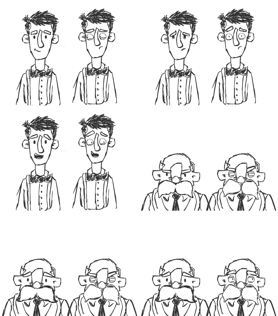
Just a quick one. I've been watching a lot of Tim Burton films recently and am having one of those "that designs really cool! I should use it" moments. I've done an animation test for my dissertation with the puppet i used for the previous mime project and have realised i might struggle to animate my entire film this year with fixed solid black eyes on my characters. I also didn't want to do moving beads again so watching all of the Tim Burton films lead to me wanting to make eyes solid and fixed in place, then have the pupil move freely on top with tacky wax or magnets. 

SO, i've done a couple more flash tests with my puppet heads. Wanting to see how much emotion i can get (incredibly quickly and rushed) with only the mouth/moustache, eyelids and eyebrows moving, this was the result. 

 photo i-think-im-addicted-to-gifs_zpsa51121b3.gif

I spent much more time on the solid black eyes than the actual pupils, but am still on the fence. Leaning slightly more towards solid eyes for now but PLEASE let me know in the comments if you think i'm being dumb choosing this.

Thanks!

Disclaimer, free eye test applies only to stop motion puppets in design stages willing to participate in dangerous eye surgery implants. Does not apply to real people

Monday, 6 January 2014

props props and more props

At some point or another during production of my film, which I'm tempted to call "Cut from the same Cloth"(a suggestion from one of my tutors) i'll have to make a shed load of props!

It is much easier to make props when you have at least a basic front and side view of them so i've done the following pages on a few props i'll have to make. It was also a good chance to try out the colour scheme i've got planned. I'm trying to keep the colours all quite sepia toned so that when there is a big reveal at the end, the colour will be contrasting and vibrant. 


Wasting time in a productive way!

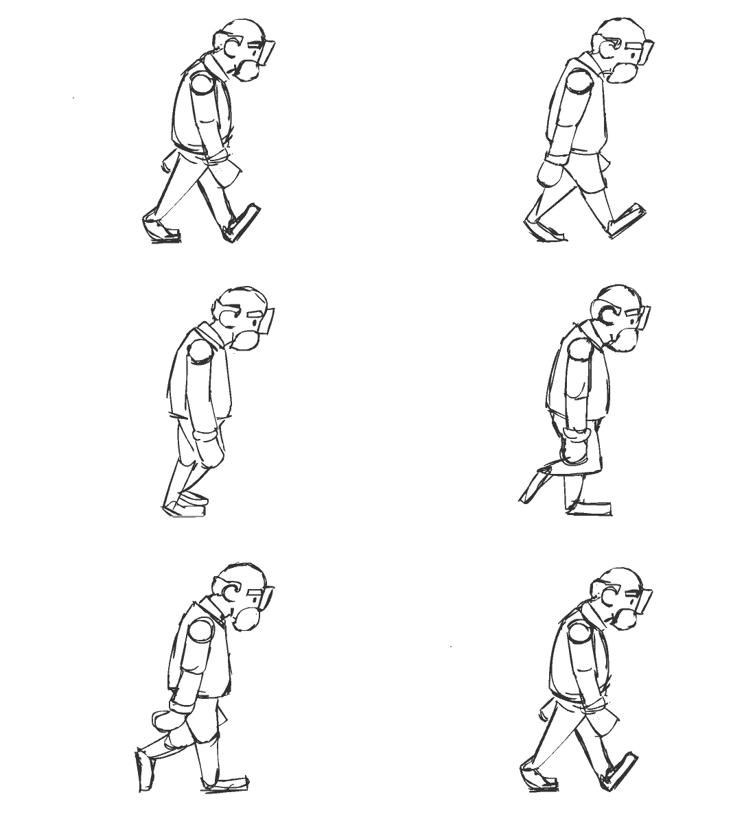
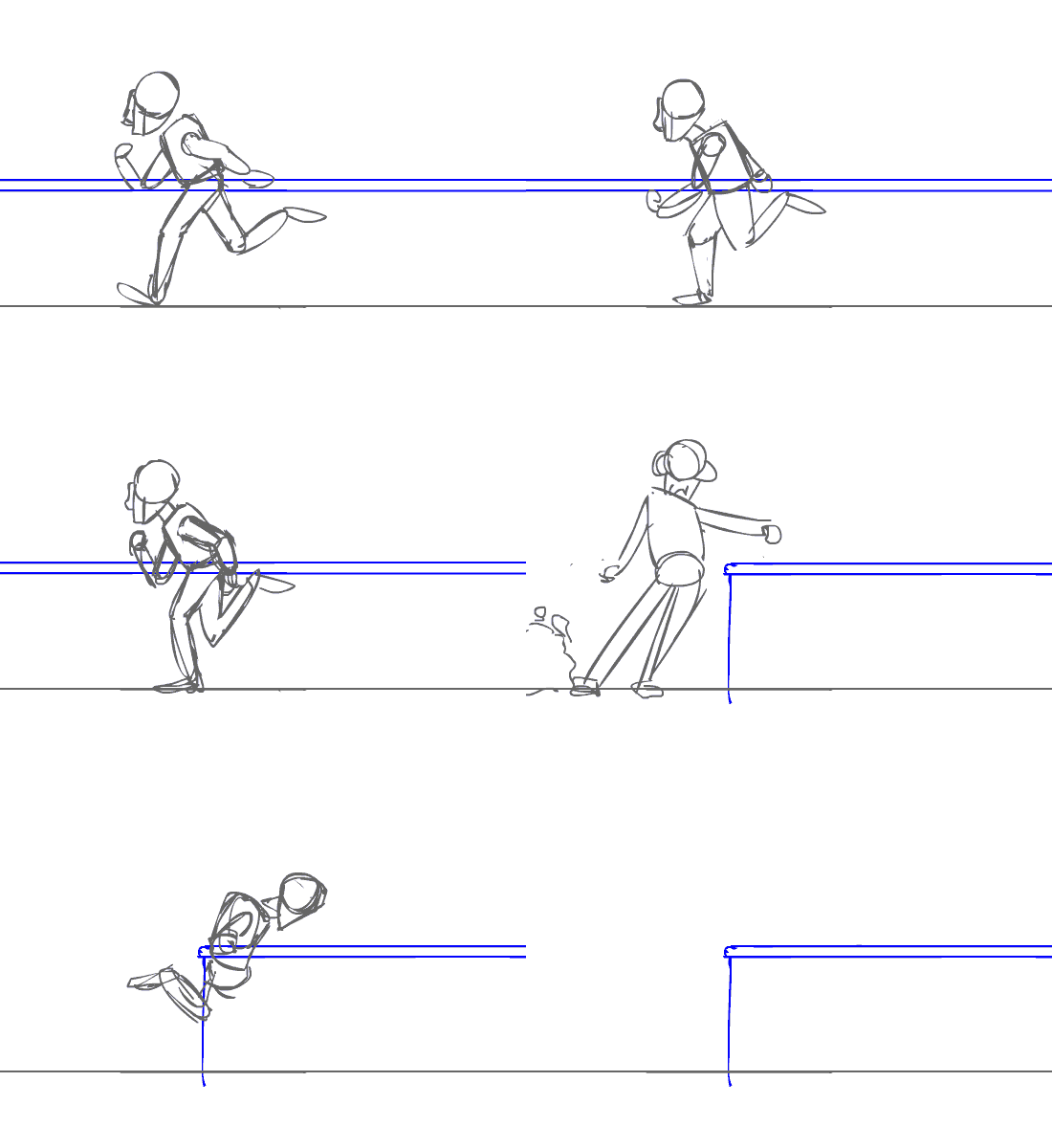
Over christmas, there was a bit of a lul of actual work. Instead i decided to try my hand at 2D animation in flash. 

It is kind of worth doing, as when it actually comes to animating the initial shot of my film, i can use these as reference! 


 photo Roy-walk_zps06f8542b.gif


 photo richard-run_zps3034d148.gif

The plan was to go back and draw the run in more detail. but i've decided to go back to doing my actual work for now!